Isn’t Springtime a beautiful thing? Pollen-lined cars, allergies, mosquito bites, oh my! But in all seriousness, Spring allows for the ‘renew and restart’ mentality to sprout and the bright and ever-changing colors to blossom. Teals, lavenders, paisies and egg blues swoon the masses of bushes that line the beautifully landscaped River Oaks neighborhoods – and I’m here for every second of it!
Fashion was meant to meet interiors. Let me show you what’s inspiring me this season and how the two can work so spectacular together:
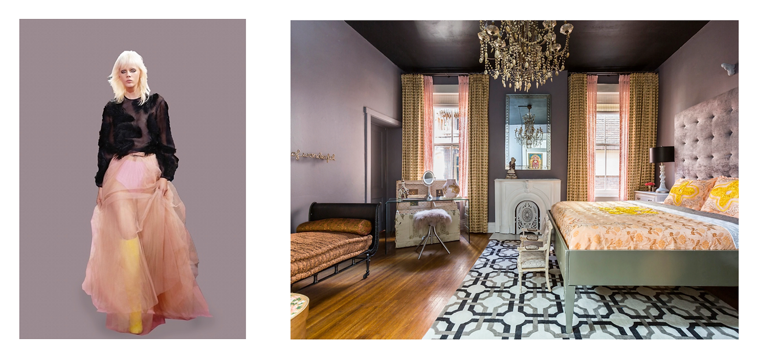
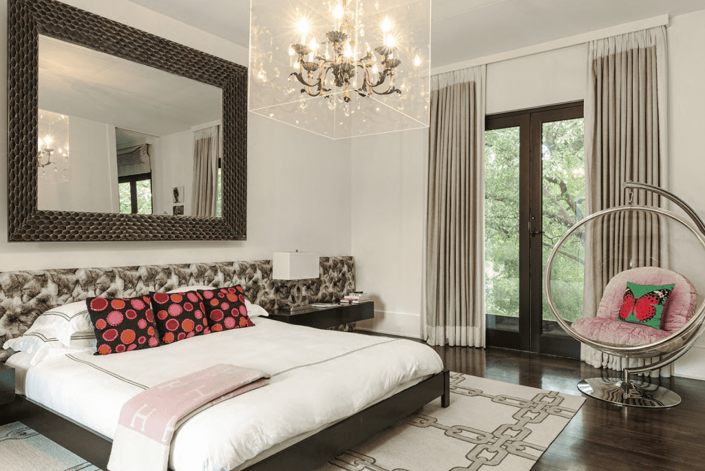
I like to pair unique color tones that traditionally don’t go well together. For example, I prefer to pair nude and chartreuse for an unexpected twist. In this bedroom, I chose to ground those colors with a patterned rug and a dark ceiling for a more dramatic look, highlighting the fun color mix. In contrast, the gray walls, complimenting the similar hue of nude, bring sweet serenity to the overall space. Like fashion, they take risks. We were happy to see that Ralph & Russo shares that vision on the runway for this striking color play. Originality is timeless! #TakeChances @ralphandrusso
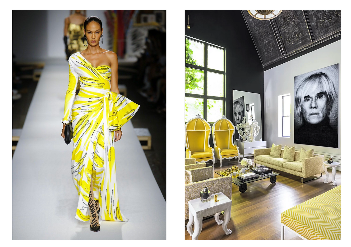
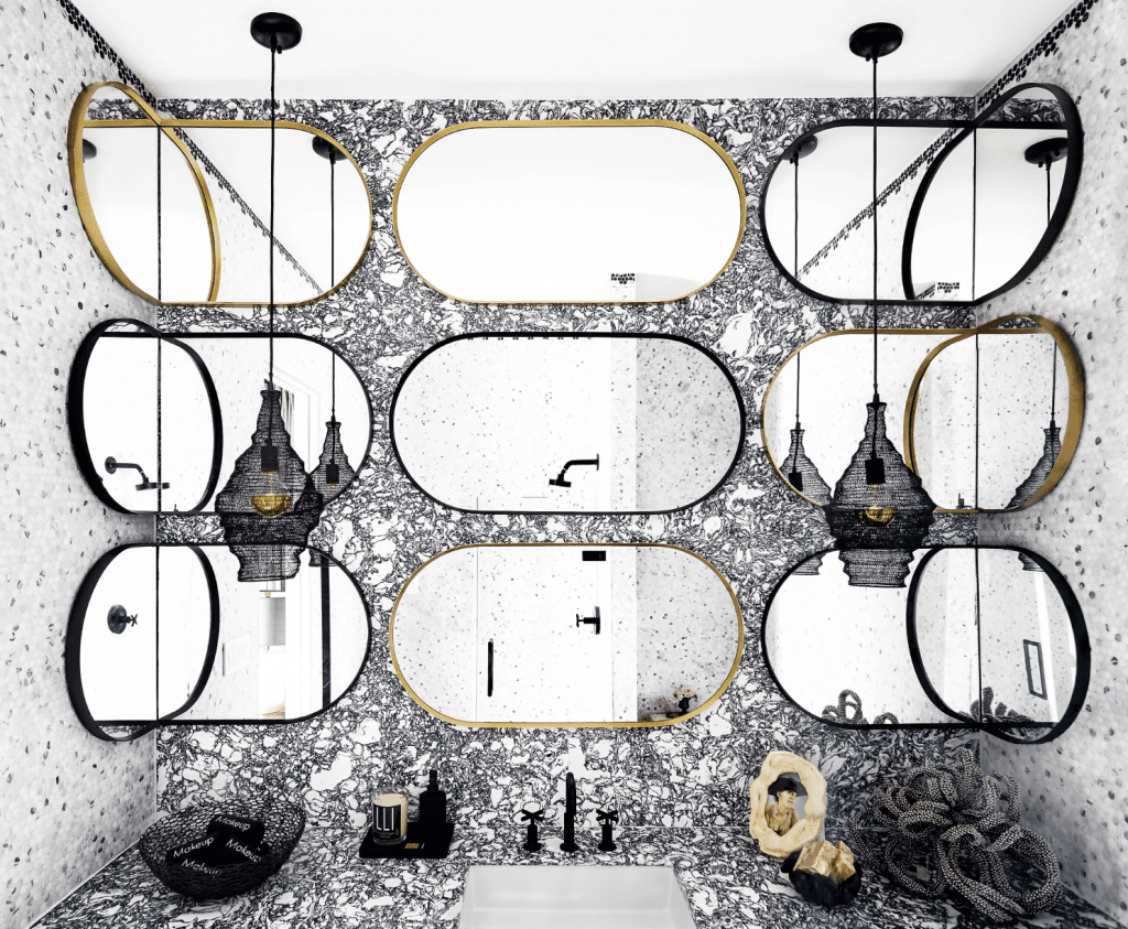
I often like to begin with a high contrast of black and white as a foundation for my interiors to add interest – especially for this Gramercy, New York chapel-turned-apartment. I chose to compliment the ever-so faded gold medallion and family crests of this historic building by using a non-competing colorway. Moschino inspires us all over again! Not to mention, the sharp and cartoon-like lines throughout the runway piece is a great symbolic reference to Andy Warhol’s classic pop culture artwork that we chose to display in this space. We welcome a visit to come sit pretty in our outfit-complimenting apartment anytime! #PerfectMatch @moschino
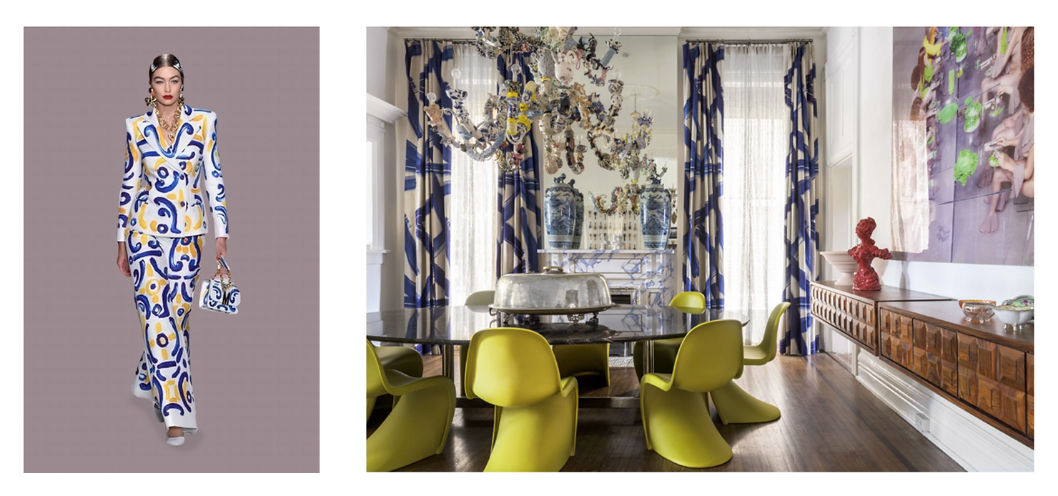
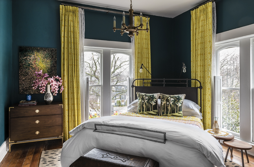
What is more classic than a blue and white English pattern? We love how Moschino visited the classic, yet brought-forward, hand painted design and worked it through the thread of this runway outfit. When choosing the perfect complement to the custom drapes, this handmade ceramic chandelier by Francesca Di Mateo was the perfect choice to bring the room to life. Her process and delicacy inspired the flow and balance of the room as we worked towards the finished look. Why waste a space by filling it with outdated colorways, when you can turn furniture to fabulous! #UniqueSpaces @moschino
@ralphandrusso
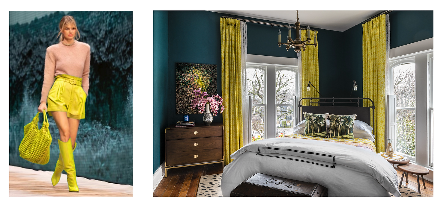
Mix and match this Spring! You may find inspiration where you least expect it.